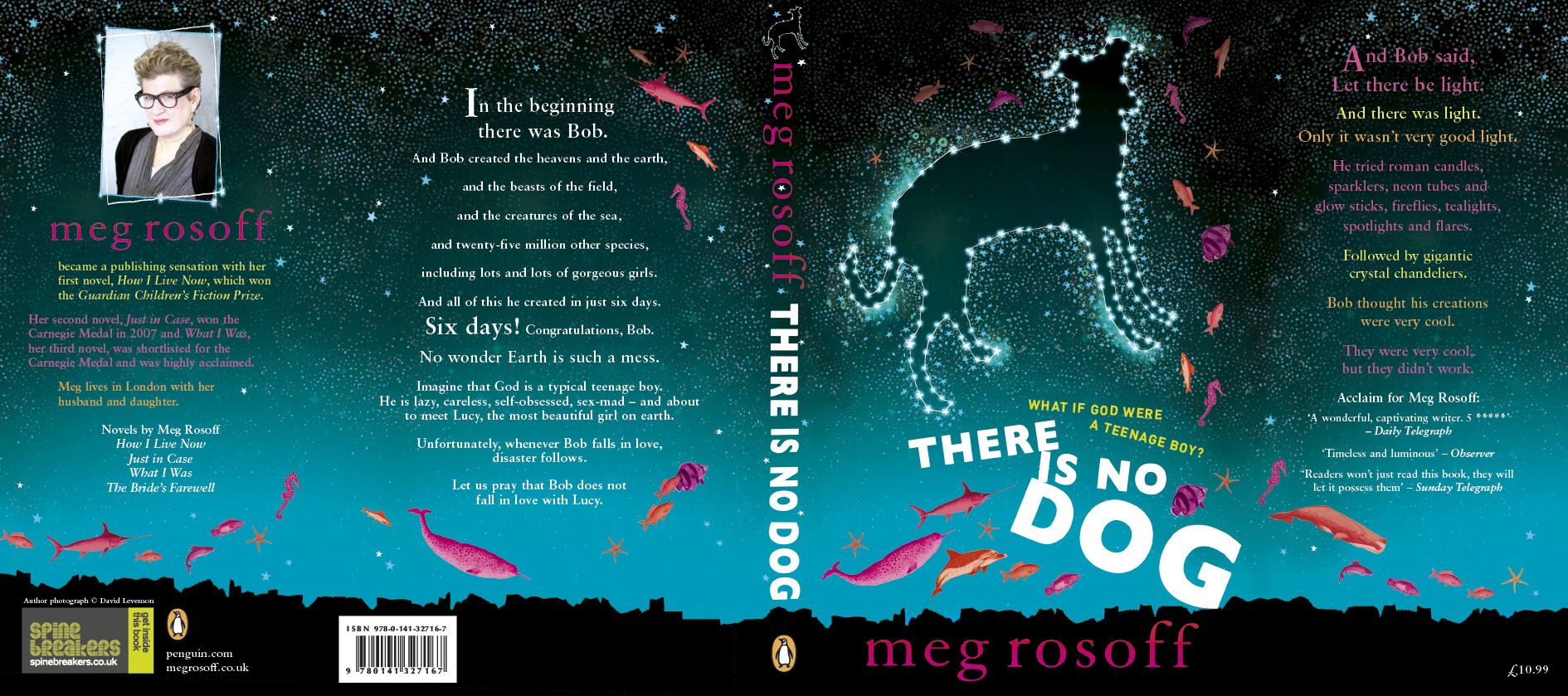
The god of cover art.
A flurry of e-mails from the art department at Penguin has inspired today's post, with various versions of the cover for the proof of There Is No Dog. The book title comes from the joke about the dyslexic atheist (if you can't figure it out, google Dyslexic Atheist), which is not necessary to understand in order to enjoy the book, but still, I wanted a bit of resonance with God-Dog. Here's the cover:
You have to imagine it with all the folds folded and flaps flapped -- otherwise it looks a bit like a dog's dinner, with so much going on.
But I really like it. Really a lot. Which, as all writers know, is not that common. The cover conversation is one that writers never tire of reviving when there's nothing particular to rant about, and always goes along the lines of "How could my deathless prose possibly sell with THAT COVER?" Ahem. I've even possibly been known to utter more or less those words. Fairly recently, in fact. Of course it was true, you see. So it doesn't count.
Edward Gorey sums it up better than I ever could, in his hilarious and tragically accurate book, The Unstrung Harp: "Mr Earbrass has received the sketch for the dustwrapper of The Unstrung Harp. Whatever were they thinking of? That drawing, those colours! On any book it would be ugly, vulgar, and illegible. On his book it would be all these, and also disastrously wrong."
My most recent theory about covers is that nobody knows anything, as William Goldman so pithily said about the film business. Sales thinks they know what sells. Booksellers think they know what sells. Writers are certain they know what doesn't sell. And everyone's wrong. Some books sell, despite, because of, or with no reference at all to the cover. Of course, given that nobody knows anything, you might as well go with your gut. "I like that!" is as good a reaction as any.
While wandering around on the web one day, I discovered a cover I'd never seen before -- it had been designed for one of my books by Clare Skeats, then an art department intern, back when my editor and I were still arguing about the title (second most common source of "discussions" with publishers). I love this cover, and finding it by mistake like that sowed the seed of doubt in my head, along the lines of "What wondrous pearls are those designers coming up with that they Never Even Bother To Show Me?" (Insert your own outraged tone of voice.)
Any day now I'll demand to see all the sketches, notes, proofs, computer doodles, and stuff they throw away. Then I'll know I'm completely, not just a little bit, mad.
p.s. I've posted an excerpt of Dog on my website. Don't get too excited if you like it, after all, I was bound to choose a really good bit....

